This is the path I'm taking to not suck at design anymore, as frankly, I'm getting tired of sucking. I've read the first 3 books here and I'm having progress on the last one. I highly recommend all 4.
(UPDATE - DISCLAIMER: this article contains Amazon affiliate links, as part of an experiment which I'm describing here, however the article expresses my genuine view)
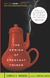
The Design of Everyday Things (link)

It explains the design of common household objects that you may use daily and it is one of the best books you can read on user experience.
To me this was an eye opener that completely changed the way I think about interfaces. It explains how people interact with the objects around them and how they learn. It explains the importance of a user's mental model of how your product works. It gives you a good feeling on what it means and why it matters to design for errors. It helps you to prevent a lot of design errors that a lot of products have.
The book itself was written in 1990, so it does have here and there some references to products that are outdated, but the analysis itself will never be outdated or obsolete. Quite the contrary - it's fascinating how user centric design guidlines stay the same, even though there are a lot of people out there that repeat the same mistakes over and over again.
When it comes to software, a complement article on the subject is User Interface Design For Programmers, by Joel Spolsky.
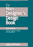
Non-Designer's Design Book (link)

Robin Williams does an excelent job introducing you to the basic concepts of designing visuals, with clearly explained principles and techniques.
It's pretty hard for us developers to design anything pleasing to the eye. And that's not the only problem you're facing - the visuals of a site have to give hints to the user about their next actions, so you've got many constraints to worry about. Sometimes you get lucky by just copying and combining other designs you like. Sometimes you have a good idea about what you want, but one day you like the result, then the next it looks like an abomination.
The book goes into some detail about how designers think. It has plenty of visual examples, it gives you many examples of what not to do, it explains how to work around those problems, it is concise and doesn't bore you to tears - while not that useful for someone with design experience, for a developer that sucks at this game, this is a really, really good design manual.
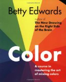
Color: A Course in Mastering the Art of Mixing Colors (link)

One of the most surprisingly difficult problems when creating designs is picking the colors palette. This is so goddamn difficult sometimes. We do know that certain color combinations work better than others, but how do you pick them? How can you achieve harmony as to not make your users' eyes bleed? And not only that, but you also want to emphasise certain portions of your pages in a way to attract attention - did you know that according to statistics, more car accidents involve red cars than any other color?
There are web services out there, like Adobe Kuler or COLOURlovers.com which allow you to choose color palettes created by other people - the PROBLEM being that you'll never know what makes a palette work and so you'll make good changes to it only by luck or with expensive A/B testing.
This book by Betty Edwards is not your only choice for learning Color Theory. It isn't even related to web design in any way, having a whole section on mixing oil paint.
However, I believe that color theory can only be learned from people that have real experience in mixing colors. For this reason, articles or books about color theory that aren't written by painters are quite shallow - and the theory in this book transcends the tools used.
It explains notions on color harmony, on the importance of contrast and gives you valuable insight and advices on how to mix and match colors. It's a fun read too, because of the quotes from faimous people contained - however, it's not a light read because you do have to execute the exercises within for best results. But I think it is worth it.
(I'm now my wife's advisor on colors, although our bedroom ended up looking awful, but there's no substitute for experience earned by making mistakes and at least I know where I went wrong ;))
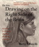
Drawing on the Right Side of the Brain (link)

I've picked up drawing as my hobby. I'm only a beginner, but it's a fun hobby to have - it's impressive, silent and inexpensive. It also boosts your creativity like nothing else, as the only real limit you have is your imagination (much like software development ;))
Ever tried drawing anything lately? You should. The results will be awful. But do you know why? It's not your hand, it's not from a lack of talent, it's your eyes that are deceiving you - in order to learn how to draw, you have to relearn how to see. That's because everything you see is right now filtered and transformed by your brain - as a cheap/fast exercise, look in a mirror at an arm's length and take a guess if your mirrored head is of the same size as your actual head (then use your hands to measure). The picture you're getting through your mind's eye is deceiving and for drawing skill and creativity to emerge you have to silence your brain.
This book of Betty Edwards has an awesome technique that works for everybody. Or so she says, but as far as I'm concerned I'm progressing in leaps and bounds and can already do drawings that I couldn't hope of doing before starting to read this book ... I also promise to publish some drawings, but only after I'll get decent (only started to do this 2 months ago, a frog doesn't transform into a prince overnight you know).
How does drawing help you in web design? Well, do you really have to ask?
Update: Suggestions Received from Readers
- The Design of Design, by Frederick P. Brooks
- Visual Language for Designers, by Connie Malamed
- Interaction of Color, by Josef Albers (review)
- Keys to Drawing, by Bert Dodson
- Design for Hackers, by David Kadavy
- Design and Form, by Johannes Itten
- Elements of Color, by Johannes Itten
- Principles of Form and Design, by Wucius Wong
- Thinking with a Pencil, by Henning Nelms
- The Sciences of the Artificial, by Herbert A. Simon
- Designerly Ways of Knowing, by Nigel Cross
- Designing Visual Interfaces, by Kevin Mullet and Darrell Sano
- Grid Systems: Principles of Organizing Type, by Kimberly Elam (presentation)
- 101 Things I Learned in Architecture School, by Matthew Frederick
Thanks people, wow, I know have my hands full :) ... keep `em coming!